
The Importance of Responsive Design in User Experience of Applications and Websites
Understanding Responsive Design
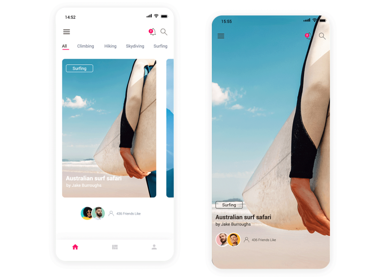
The modern internet user expects functionality and accessibility from every click. As mobile devices continue to dominate the landscape, businesses must emphasize the importance of responsive design to cater to these expectations. This approach involves creating websites and applications that adapt to various screen sizes, providing users with an optimal viewing experience across all devices, from sleek smartphones to larger desktop monitors. This is more than just a trend; it’s a pivotal strategy that enhances the overall user experience.
Benefits of Responsive Design
One of the hallmark advantages of responsive design is improved accessibility. When web developers prioritize this design methodology, users can effortlessly navigate websites without worrying about misaligned text or images. For instance, consider an online shopping platform. Users accessing it via their smartphones can easily browse product categories and make purchases without frustration, regardless of screen size. This ease of use can lead to higher conversion rates.
Equally important is the concept of a consistent experience. When a user visits a website on their tablet, they expect the interface to mirror the experience they would receive on a desktop. This consistency builds trust and encourages users to engage longer with the content. For example, news websites that utilize responsive design allow readers to access breaking news seamlessly, fostering loyalty among their audience.
SEO Benefits
There are also undeniable SEO advantages associated with responsive design. Search engines like Google have prioritized mobile-friendly websites in their search rankings. This means that businesses embracing responsive design are not just enhancing user experience but also improving their chances of being discovered online. A well-optimized site can climb the ranks in search results, drawing more organic traffic and potential customers. As consumers increasingly turn to their smartphones for searches—over 60% of all Google searches now come from mobile devices—neglecting mobile optimization can significantly hinder a website’s visibility and performance.
The Risk of Non-Responsive Design
As consumer behavior continues to evolve, the risks associated with non-responsive design become clearer. A website that does not adapt to different devices can alienate users, leading to increased bounce rates and lost opportunities. A recent study indicated that approximately 61% of users are unlikely to return to a mobile site if they had trouble accessing it the first time. This statistic underscores the pressing need for businesses to invest in responsive design to ensure they do not miss out on the growing demographic of mobile users.

Conclusion
In conclusion, adopting responsive design is not merely a technical requirement; it reflects a deeper commitment to enhancing user experience across platforms. Businesses that take this initiative seriously position themselves to attract and retain customers in today’s competitive digital marketplace. As we continue our exploration of responsive design, we’ll uncover more insights into how developers and designers can create fluid, dynamic websites that cater to the diverse needs of modern users.
DISCOVER MORE: Click here to optimize your cloud storage costs
The Impact of Responsive Design on User Engagement
In an era where multitasking and mobility are the norms, responsive design emerges as a crucial factor in retaining user engagement. Companies that prioritize mobile compatibility can prevent users from becoming frustrated by cumbersome layouts or slow-loading pages. A well-crafted responsive design not only offers seamless navigation but also enhances user satisfaction by reducing the cognitive load associated with adapting to different devices. This is especially pertinent in the United States, where a significant portion of the population accesses web content primarily via smartphones and tablets.
Furthermore, responsive design plays a key role in enhancing load times. A recent survey indicated that 53% of mobile users will abandon a site if it takes longer than three seconds to load. This statistic serves as a stark reminder that speed is crucial in capturing and retaining user interest. By ensuring that a website or application is responsive, developers can optimize images, streamline content, and eliminate excessive redirects that often plague non-responsive sites. The outcome is not merely a prettier interface; it is a dynamic user experience that propels engagement metrics.
Building Trust Through Responsive Interaction
Interaction with a website is not a one-time event; it’s a journey. When users feel that their engagements are respected through thoughtful design, they are more likely to connect with the brand. A responsive design fosters a sense of trust by ensuring that all interactions—be it filling out forms, participating in chats, or browsing a catalog—are effortless and intuitive. This ease translates to greater customer loyalty and repeat visits.
Competitive Advantage and Market Positioning
In today’s crowded digital space, having a sophisticated responsive design can be the differentiator that sets a business apart. Companies embracing this approach can capitalize on improved market positioning by consistently delivering high-quality user experiences. The following are notable benefits that emphasize the competitive edge provided by responsive design:
- Higher Conversion Rates: Streamlined navigation and quick access to information can lead to increased sales and customer sign-ups.
- Enhanced Social Sharing: Users are more inclined to share content that is easy to consume across various platforms, which organically expands brand reach.
- Stronger Brand Reputation: A responsive design reflects a company’s investment in user experience, leading to positive word-of-mouth marketing.
As businesses grapple with digital transformation, prioritizing responsive design is no longer optional. The necessity to engage users on their preferred devices dictates the future of online interactions. More than just a design update, it symbolizes a commitment to prioritizing user experience and the evolution of web standards.
Challenges in Implementing Responsive Design
While the benefits of responsive design are substantial, it is equally essential to acknowledge the challenges that come with its implementation. Designing for multiple screen sizes involves a strategic approach that requires significant foresight and expertise in coding practices. This often means revising existing frameworks or investing in advanced technologies that can optimize performance under various conditions. However, avoiding these challenges can lead to losses—both in user engagement and increased operational costs.
To sum up, the significance of responsive design lies in its ability to shape user experiences positively, foster brand loyalty, and ultimately contribute to a company’s bottom line. With users more empowered and discerning than ever, the modern digital landscape necessitates a shift toward designs that are as adaptable as the audience they serve. As we explore further, we will dive deeper into best practices for creating responsive websites and applications that meet the diverse needs of users today.
The ever-evolving digital landscape has made it essential for websites and applications to adapt seamlessly to a variety of devices and screen sizes. Responsive Design enhances user experience by ensuring that content is displayed effectively, regardless of whether users are on mobile phones, tablets, or desktop computers. When users can navigate an application or website effortlessly, they are more likely to engage with the content and return in the future, thereby increasing conversion rates.
Moreover, a responsive design is not merely a trend; it has become a crucial demand in the user experience realm. Users have shown impatience towards websites that are not optimized for mobile viewing, often leading to high bounce rates. According to recent studies, a staggering percentage of users expect websites to load in under 3 seconds. If a site fails to meet this expectation, there’s a strong likelihood that visitors will abandon it. Thus, implementing a responsive design can greatly reduce the chances of losing potential customers.
Furthermore, search engines prioritize mobile-friendly websites in their search results. This means that responsive design isn’t just about aesthetics; it also plays a significant role in the overall SEO strategy of a website. Google’s algorithm favors sites that provide an optimal viewing experience on all devices, which can lead to improved rankings and an increase in organic traffic. Therefore, investing in responsive design isn’t just an enhancement for user experience; it’s also a smart business decision.
| Impact of Responsive Design | User Experience Benefits |
|---|---|
| Enhanced Accessibility | Allows users to access content anywhere, anytime. |
| Improved Engagement | Greater interaction leads to higher retention rates. |
| SEO Advantages | Boosts search rankings through better user experiences. |
The use of responsive design ultimately reflects a commitment to quality and user satisfaction. In an age where every second counts, a responsive approach not only addresses the needs of the modern user but also positions businesses for greater success in a competitive marketplace. Each aspect of design must consider the user journey, ensuring that the experience remains fluid and uninterrupted across various devices. As technology continues to advance, staying ahead means embracing responsive design as a fundamental principle in creating applications and websites that resonate with users.
DON’T MISS: Click here to optimize your cloud storage costs
Emphasizing the Role of Accessibility in Responsive Design
Responsive design is not just about aesthetics; it fundamentally shapes accessibility. An accessible website or application is one that provides all users, including those with disabilities, the opportunity to engage fully with its content. According to the World Health Organization, approximately 15% of the global population lives with some form of disability, highlighting the importance of integrating accessibility features into responsive design. By designing sites to accommodate screen readers, assistive technologies, and various input methods, businesses can reach a broader audience, ensuring equitable access to information and services.
Furthermore, companies that embrace accessibility through responsive design can significantly enhance their user experiences. For instance, implementing features such as adjustable text size, color contrast options, and touch-friendly interfaces not only benefits users with specific needs but improves usability for all. A study by the Interactive Accessibility Institute found that websites with accessibility features experience fewer bounce rates and longer engagement times—benefits that can directly correlate with increased conversions.
The Importance of Consistency Across Devices
In a digital world inundated with touchpoints, maintaining a consistent user experience across devices is paramount. Responsive design ensures that users receive the same quality of experience, regardless of whether they are accessing content from a desktop computer, tablet, or smartphone. This uniformity reinforces brand identity and builds recognition, as users come to associate positive experiences with a specific platform.
For instance, think of how often users switch from one device to another throughout a day—starting a task on the office desktop, continuing it on a tablet during lunch, and finally finishing on their smartphone at home. If each interaction appears starkly different, it can lead to confusion and frustration, which may deter users from returning. A well-implemented responsive design addresses these intricacies, ensuring that key functionalities remain accessible and intuitive across all platforms.
Integrating SEO: A Dual Benefit
Responsive design is not just beneficial for user experience; it also plays an instrumental role in search engine optimization (SEO). Search engines like Google advocate for responsive design as it simplifies the crawling process. By having a single, fluid URL that adapts to any device, businesses can streamline their SEO efforts, improving their visibility on search engine results pages (SERPs).
Statistics indicate that mobile-friendliness is a ranking factor for Google’s algorithms. Websites that do not utilize responsive design are likely to encounter lower rankings, which subsequently leads to decreased organic traffic. Therefore, the connection between responsive design and a robust SEO strategy cannot be ignored. As companies invest in enhancing their responsiveness, they not only enrich user experiences but also boost their market visibility.
Future-Proofing Through Responsive Design
As technology continues to evolve, the demand for responsive design will only grow stronger. With emerging devices—like smartwatches, smart TVs, and IoT devices—entering the marketplace, a flexible and adaptable design approach is essential for future-proofing applications and websites. Embracing responsive design ensures that content remains accessible and engaging, irrespective of the device or screen size. This forward-thinking perspective helps businesses stay relevant, demonstrating adaptability in a rapidly changing digital landscape.
An example of this can be seen with companies like Amazon, which continually adjusts and improves their design to accommodate new technologies and user preferences. By doing so, they maintain a competitive edge while meeting the diverse needs of their expanded audience. Investing in responsive design is not merely about meeting current user expectations, but also about laying the groundwork for the future of user interaction.
DON’T MISS OUT: Click here to discover how to save on cloud storage
Conclusion: The Crucial Role of Responsive Design in User Engagement
In an era where digital interactions dominate our daily lives, responsive design emerges as a cornerstone of effective user experience for applications and websites. It encapsulates a multifaceted approach that not only enhances usability across various devices but also prioritizes accessibility, creating a more inclusive digital landscape for all users. By integrating accessibility features, brands expand their potential reach significantly, accommodating diverse audiences, including individuals with disabilities.
Moreover, consistency across devices cultivates user familiarity, reinforcing brand identity and loyalty. As users switch devices seamlessly throughout their day—from desktops to smartphones—having a coherent experience reduces friction and fosters deeper engagement. Additionally, the intertwining of responsive design with search engine optimization (SEO) highlights its dual value, as responsive sites enjoy improved visibility on SERPs, ultimately driving higher organic traffic.
Looking ahead, businesses that prioritize responsive design are not merely reacting to current trends; they are future-proofing their digital presence against the rapid evolution of technology and user behavior. As new devices continue to emerge, responsive design will ensure that content remains engaging and accessible, securing a competitive edge in the saturated market. Thus, investing in responsive design is not just about meeting user expectations today, but about preparing for the dynamic landscape of tomorrow’s digital interactions.
As we embrace the importance of responsive design, it is clear that this approach is no longer an option but a necessity for businesses aiming to thrive in the digital age.
Beatriz Johnson is a seasoned tech writer and digital tools expert with a passion for simplifying the complexities of technology and mobile applications. With over a decade of experience in the tech industry, she specializes in topics like productivity apps, software reviews, and emerging digital trends. Through her work, Beatriz empowers readers to make informed technology choices and stay ahead in the ever-changing world of apps and innovation.